

A clickable prototype designed around an online shopping experience.

OVERVIEW
Field House is a brick and mortar retail shop located in Beverly, MA that specializes in home decor, home goods and gifts. This small shop is stocked with unique, handcrafted items.
In this 2 week individual project sprint, my task was to design a clickable prototype around an online shopping experience. The design was to meet the needs of the users (represented by the personas), the objectives of the business, and the goals of the brand.

CRITERIA FOR SUCCESS
Overall, Field House has a Scandinavian design aesthetic that is focused on simplicity, minimalism and functionality.
In order to bring the shops essence to life online, it was going to be necessary to keep the site bright and simple. The main focus was on the products and their staging.
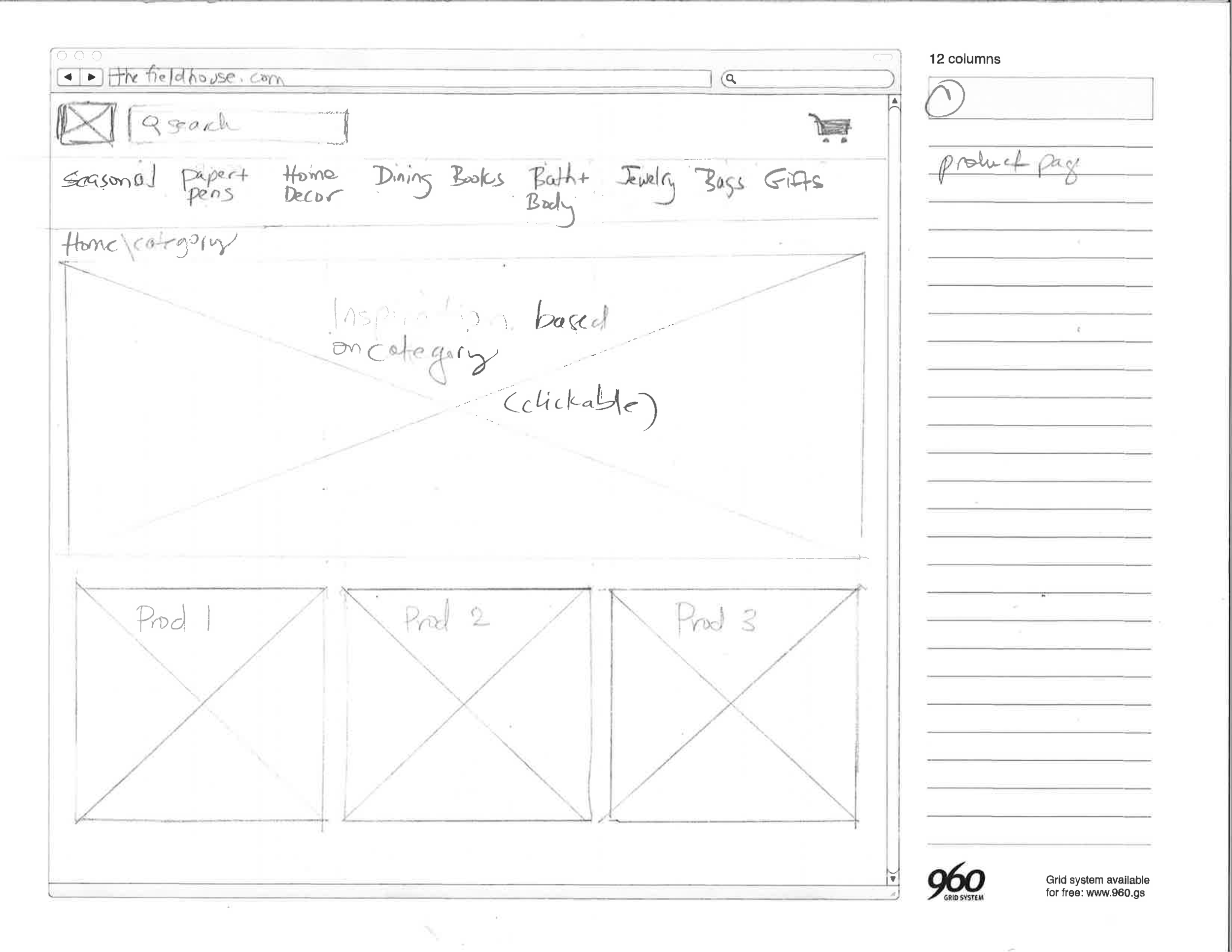
The store offers a wide range of goods, so organizing the navigation and carefully developing IA was going to be key.
PROJECT OBJECTIVES
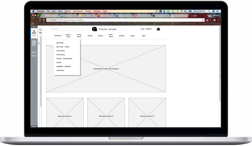
- Incorporate an effective IA strategy
- Have clear ways of locating specific products
- Steer customers toward popular products
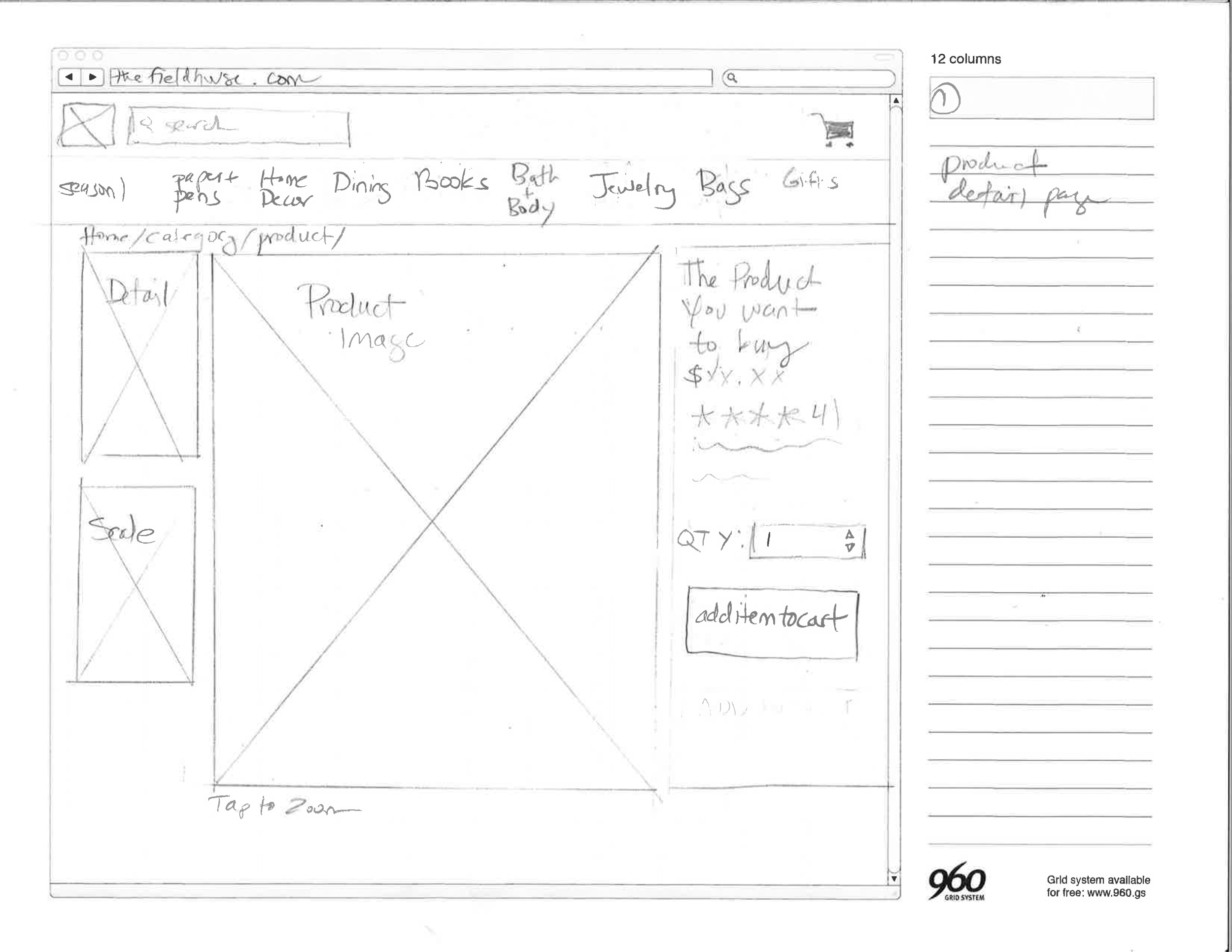
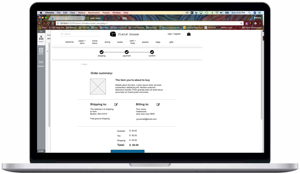
- Support a single page for each product which can be linked to directly
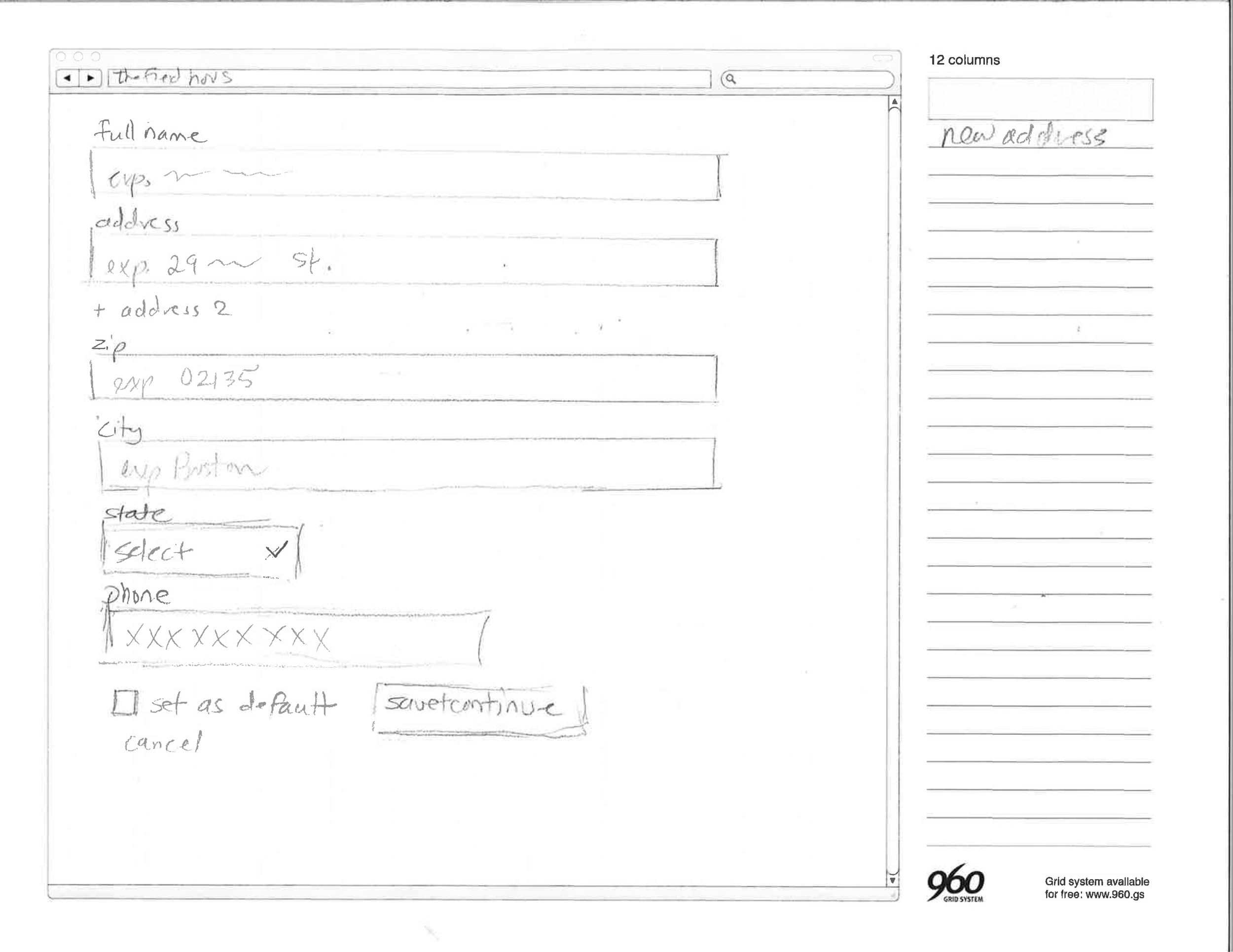
- Have an efficient means of purchasing one or more products
- Maintain consistency with the existing brand
- Allow customers to contact the business
- Have been tested with users
PROCESS

RESEARCH
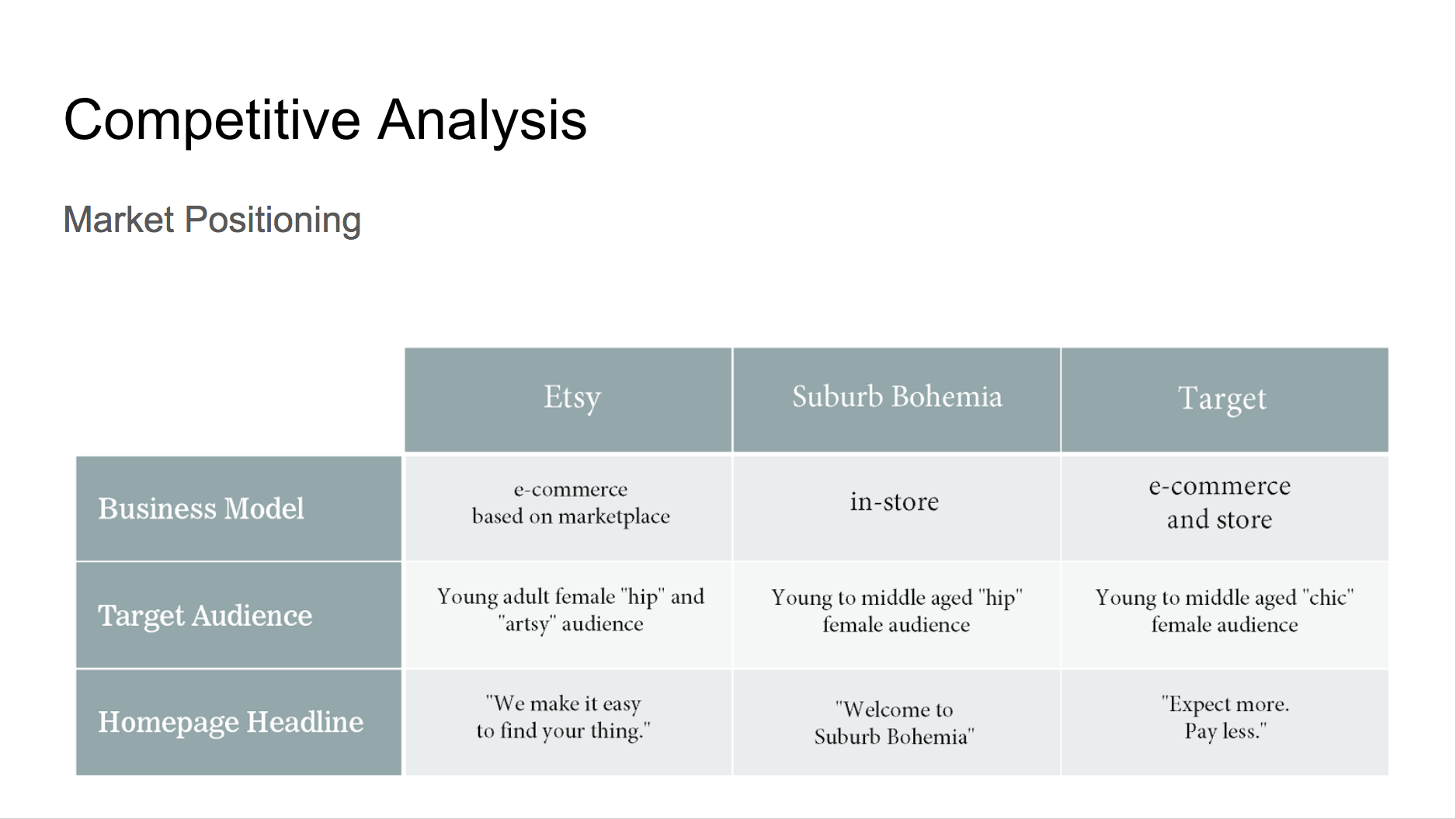
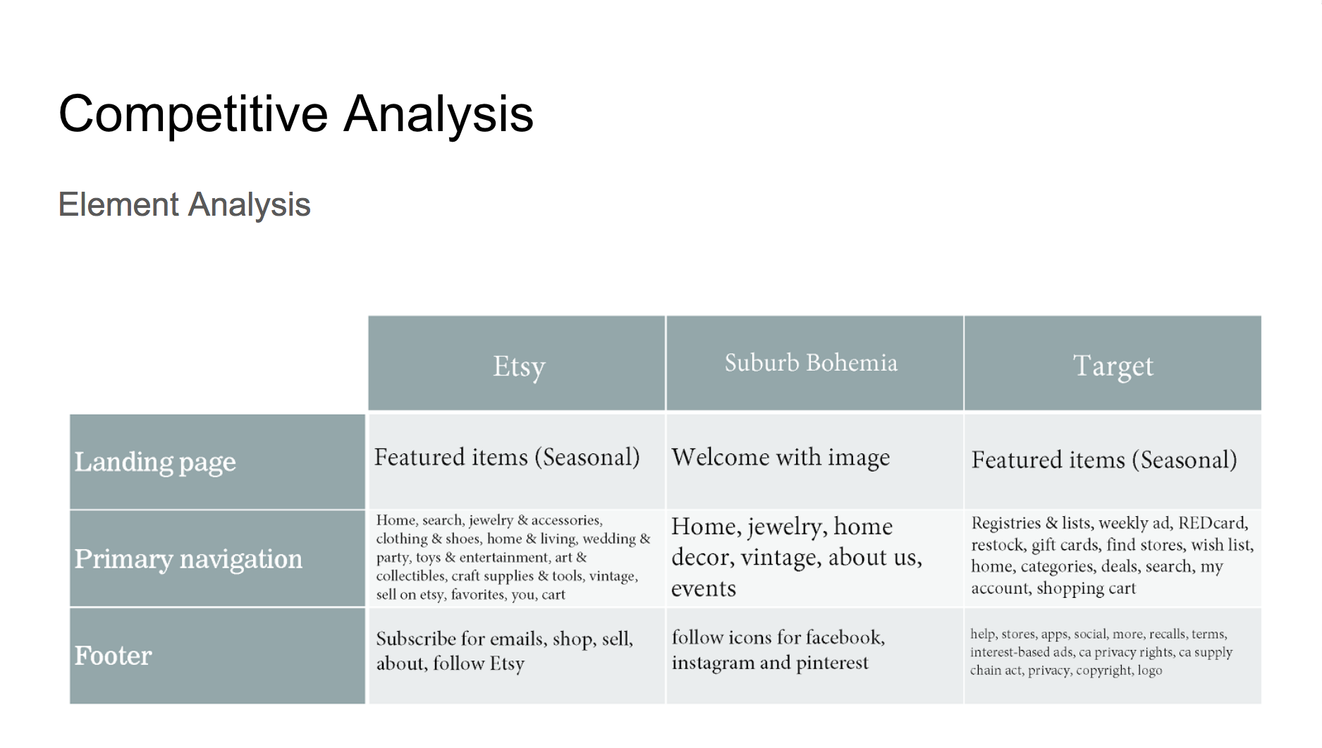
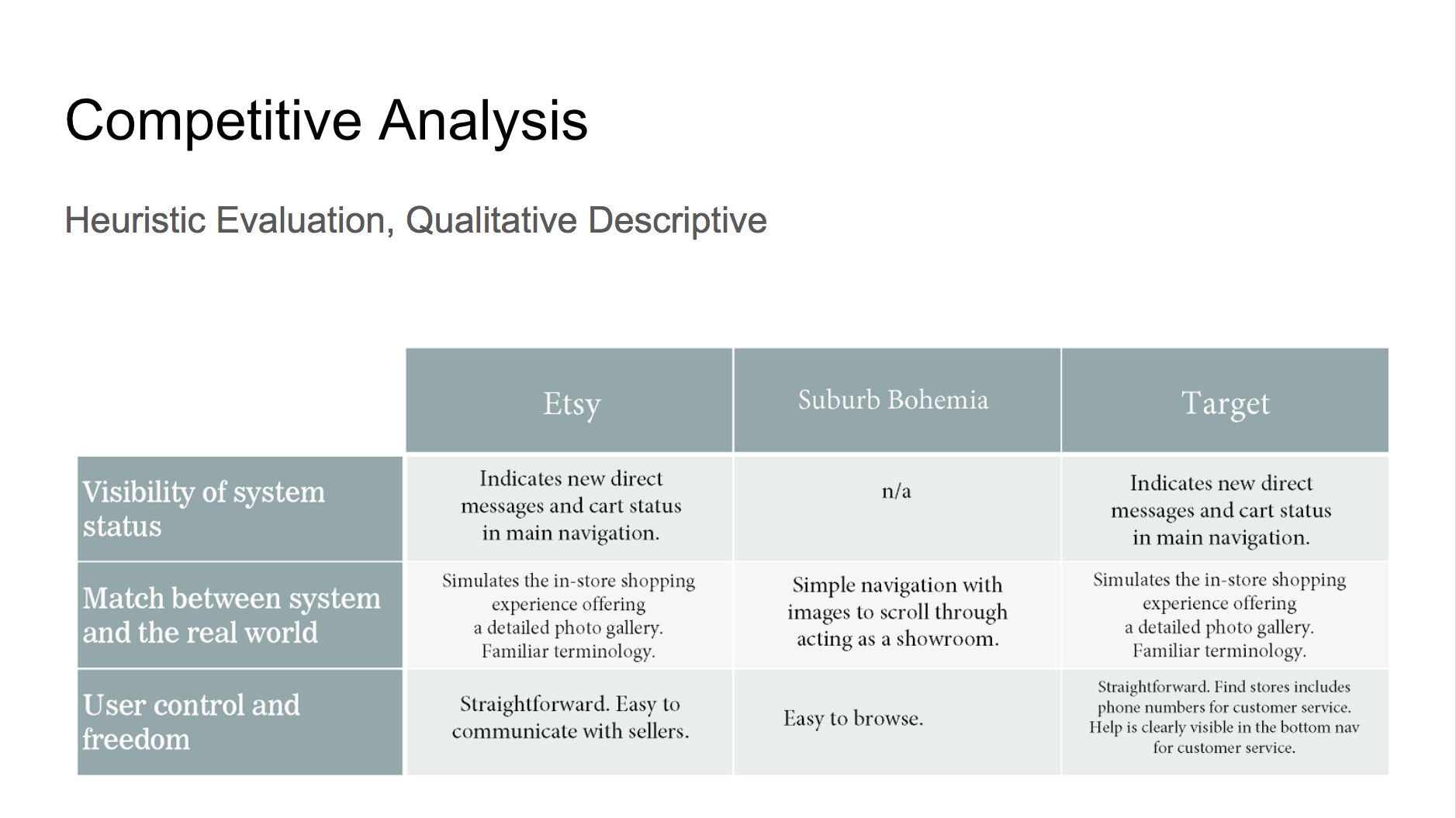
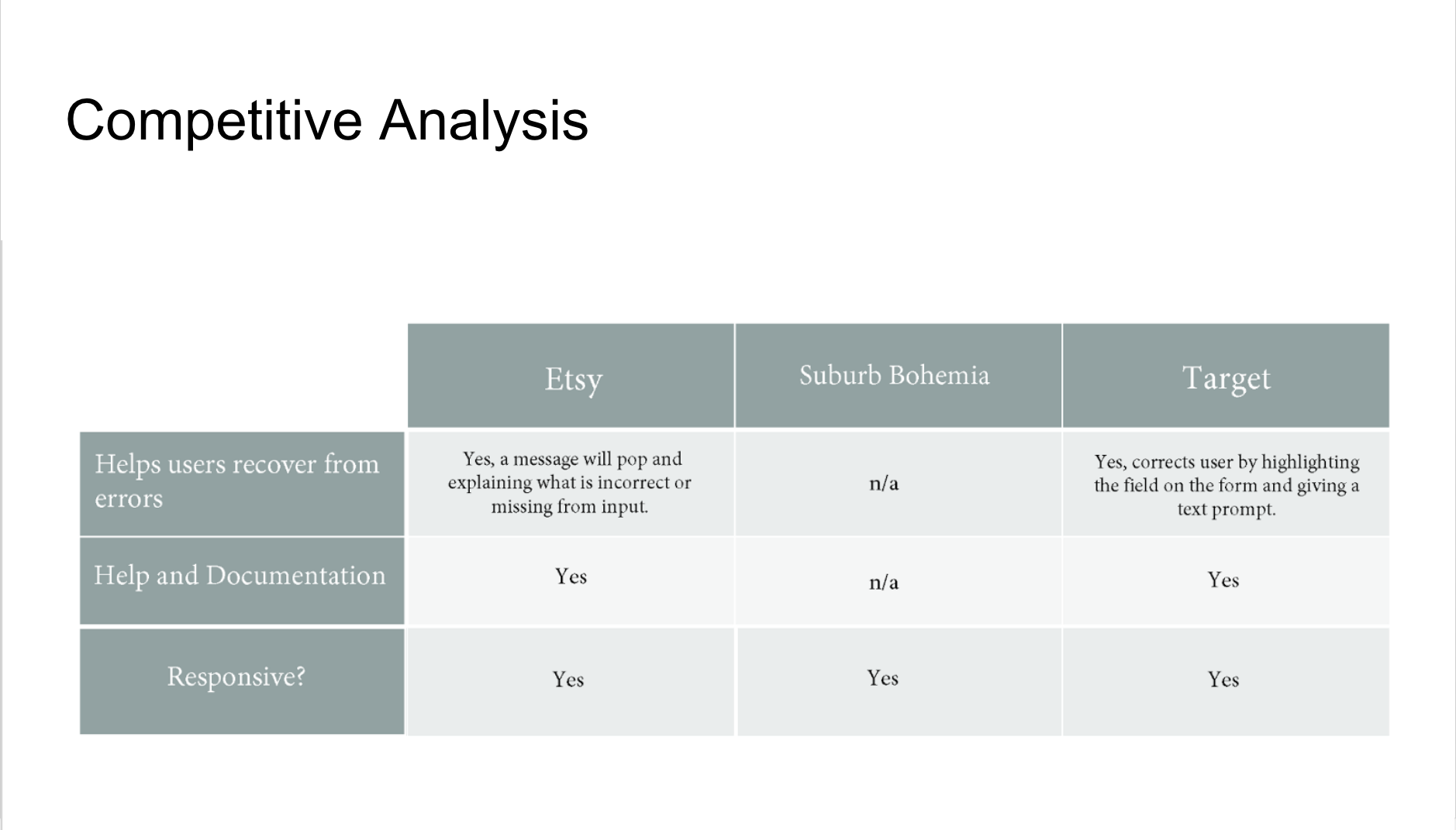
COMPETITIVE & HEURISTIC ANALYSIS

CONTEXTUAL INQUIRY
I had shopped at Field House several times in the past, but this time I visited the store with a different mindset. I spent some time browsing around the shop with the other customers and observed their shopping habits and interests. Shoppers spent a lot of time in the store. Everyone picked items up to inspect them and carefully placed them back where they belonged if they didn't put them in their basket. Everyone who I saw enter the store bought something. To be fair, it was the holiday season. I spoke to the sales associate and she told me about the sister store across the street and their other shops in Salem. She also told me that Field House was intentionally brick & mortar and didn't intend to have a website.
SURVEY
A survey successfully provided me with three target users to interview.
USER INTERVIEWS

I interviewed 3 people.
We discussed online shopping habits and user pain points throughout the interviews. After synthesizing my research I discovered the following:
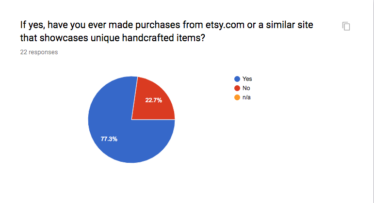
- Everyone I interviewed preferred to shop in a physical store when purchasing unique, artistic home decor and gift items. They craved the experience of examining items on a personal level.
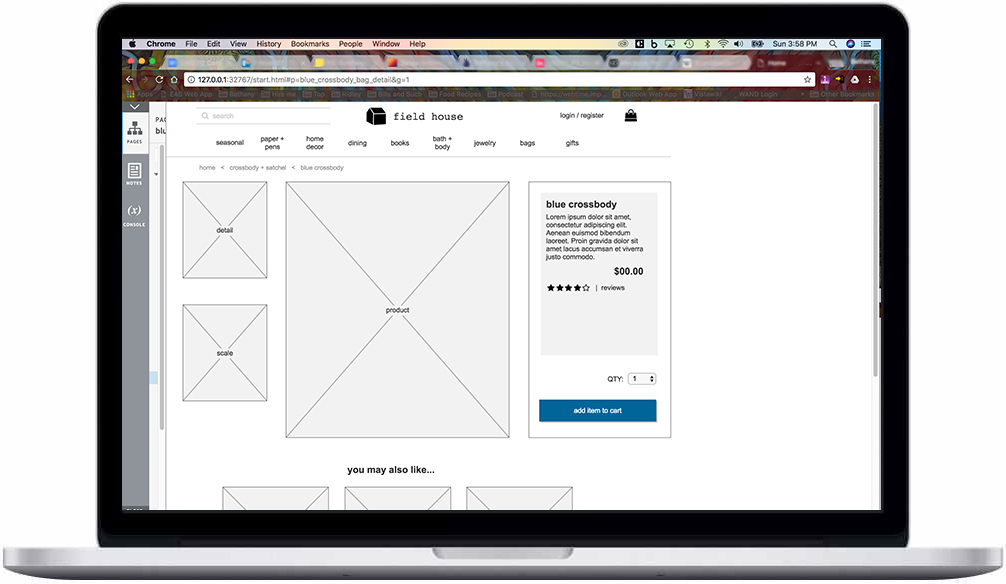
Two people mentioned the fact that it is not as easy to create a mood or emotion on an e-commerce site. Representing the product's scale is also an issue.
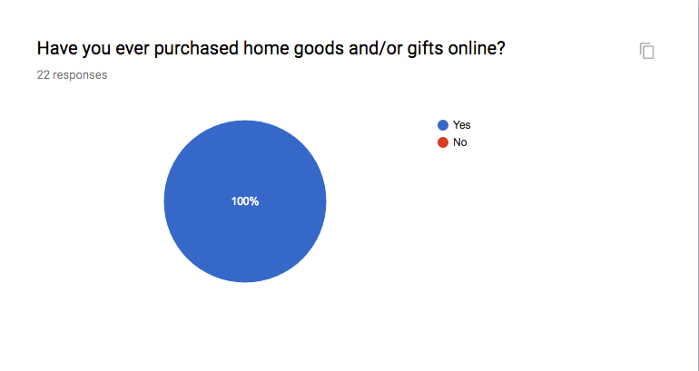
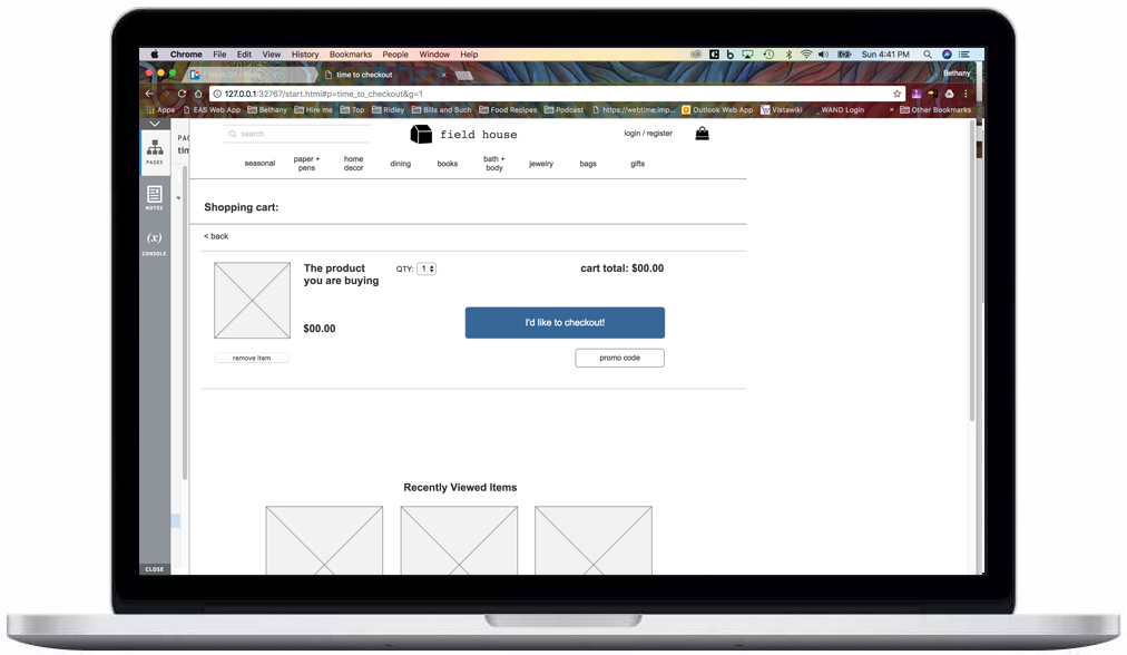
Everyone had been frustrated by a poor shopping cart experience. A seamless checkout process was key. No one wanted to think when it was time to checkout.
User interviews revealed that future customers would value the the following online features:

Easy checkout

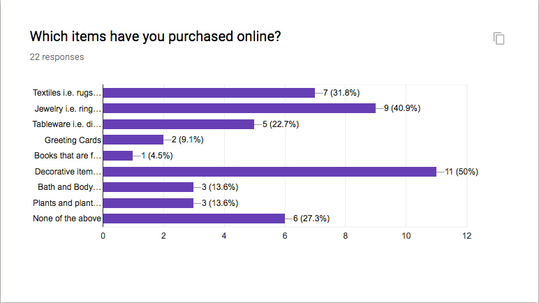
Ability to zoom in on products

Scale of products

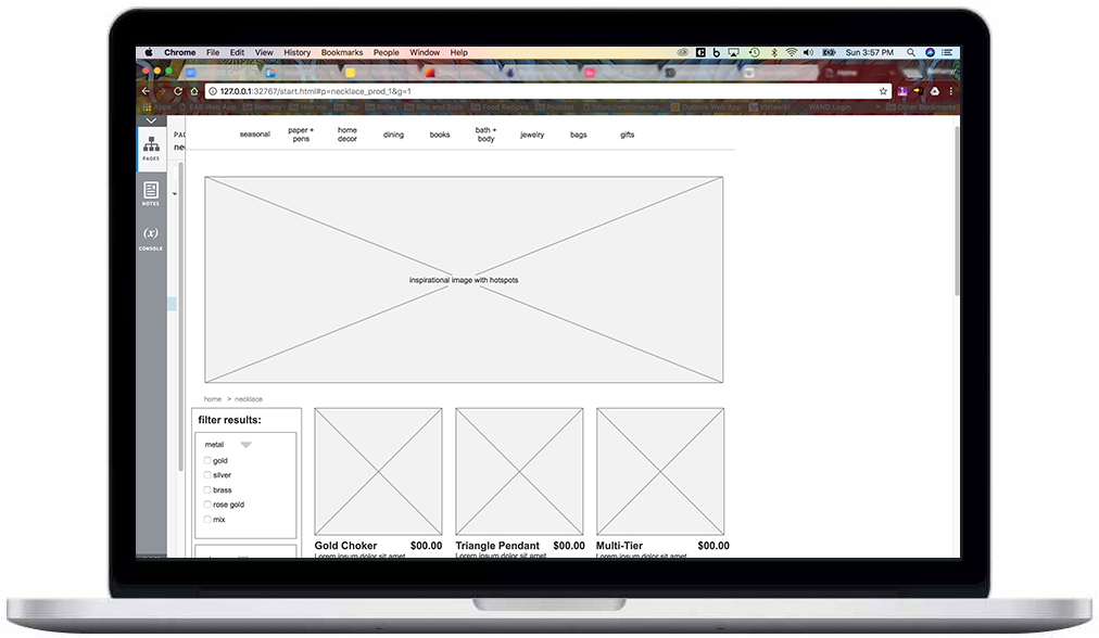
Filtering capability
SYNTHESIS
AFFINITY DIAGRAM
I created an affinity diagram to discover themes within the user interviews.
"Seeing items staged to understand scale is important."
"Small boutique shops offer inspiration and aspiration."

"There is no tactile or visceral experience online."
"Don't make me think about paying. Make it easy!"
TARGET PERSONA
After synthesizing the qualitative data from the interviews I created a primary user persona:
Becky Davis, Female, 38 years old, Boston, MA, Graphic Designer, NYU
Goals:
To give the perfect gift to friends and loved ones for special occasions.
To have the gift reflect her personal taste while pleasing the receiver.
To feel a sense of joy from finding and giving perfect gift.

IDEATION
CARD SORTING
With over 100 products to categorize I conducted several open card sorts. Each product was written on a note card and all the cards were given to the participants. I was able to see patterns in the way that people were sorting the cards very quickly and from here I was able to develop the taxonomy for the site.
- Seasonal
- Paper & Pens
- Home Decor
- Dining
- Books
- Bath & Body
- Jewelry
- Bags
- Gifts

User participates in an open card sort.
SITE MAP

USER SCENARIO
Becky’s best friend has a birthday coming up in two weeks. With her hectic schedule she worries she won’t find the time to get to her favorite gift shop to do some shopping. She then remembers that the Field House now has online shopping and quickly opens a new tab in Chrome and starts browsing the site. The online store has all the things she loves about the physical shop but she’s pleased to see that it’s actually easier to find what she’s looking for because it’s broken down into categories. She decides she wants to buy a decorative tray for her “bestie” so she adds it to her cart and flows through a seamless shopping cart experience.
USER FLOW
Sitemaps detailing the hierarchy of categories were developed in Axure RP. User flow diagrams were developed using Axure RP to show the user-side logic required to locate items specific to the Field House website. Use cases and scenarios were developed to understand how target users would interact with the user interface.

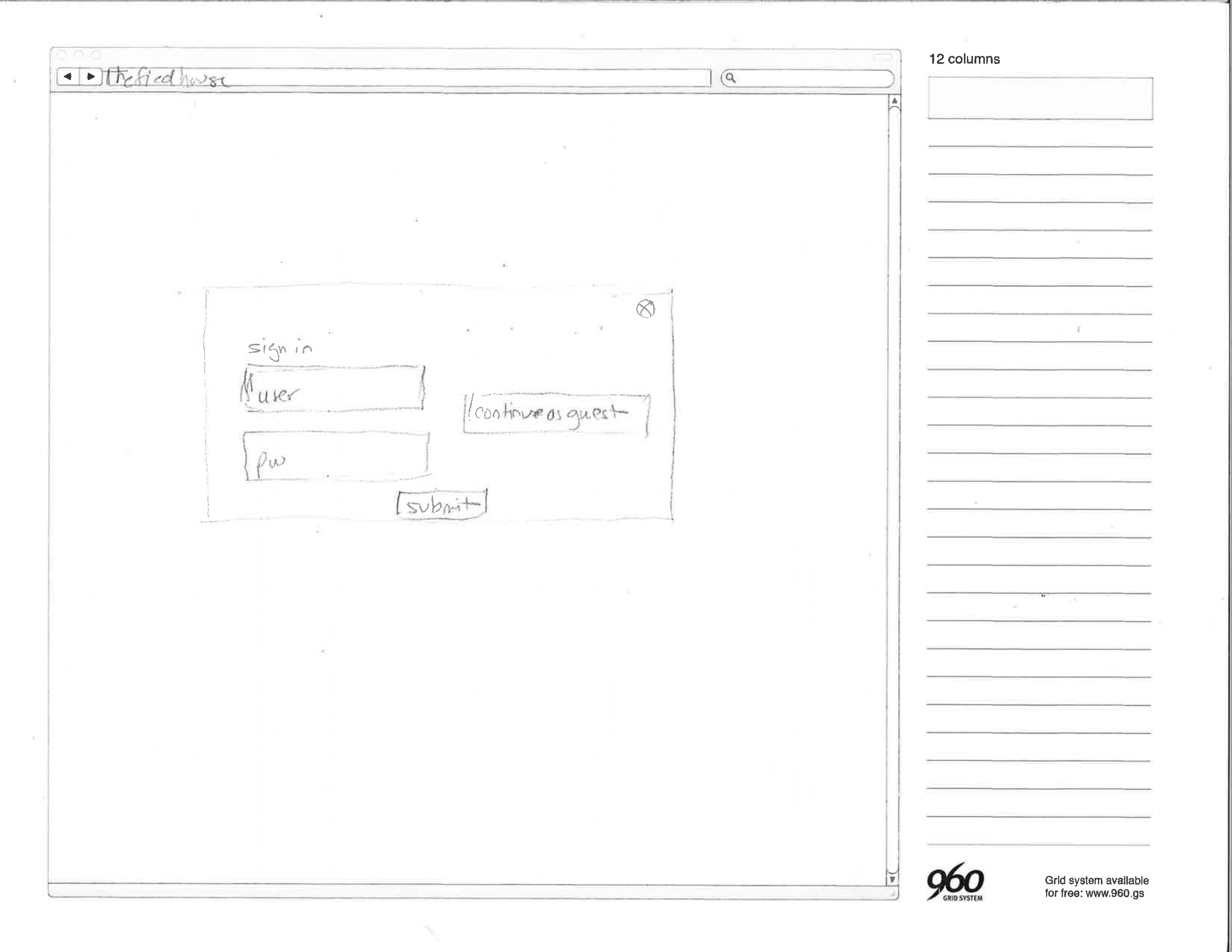
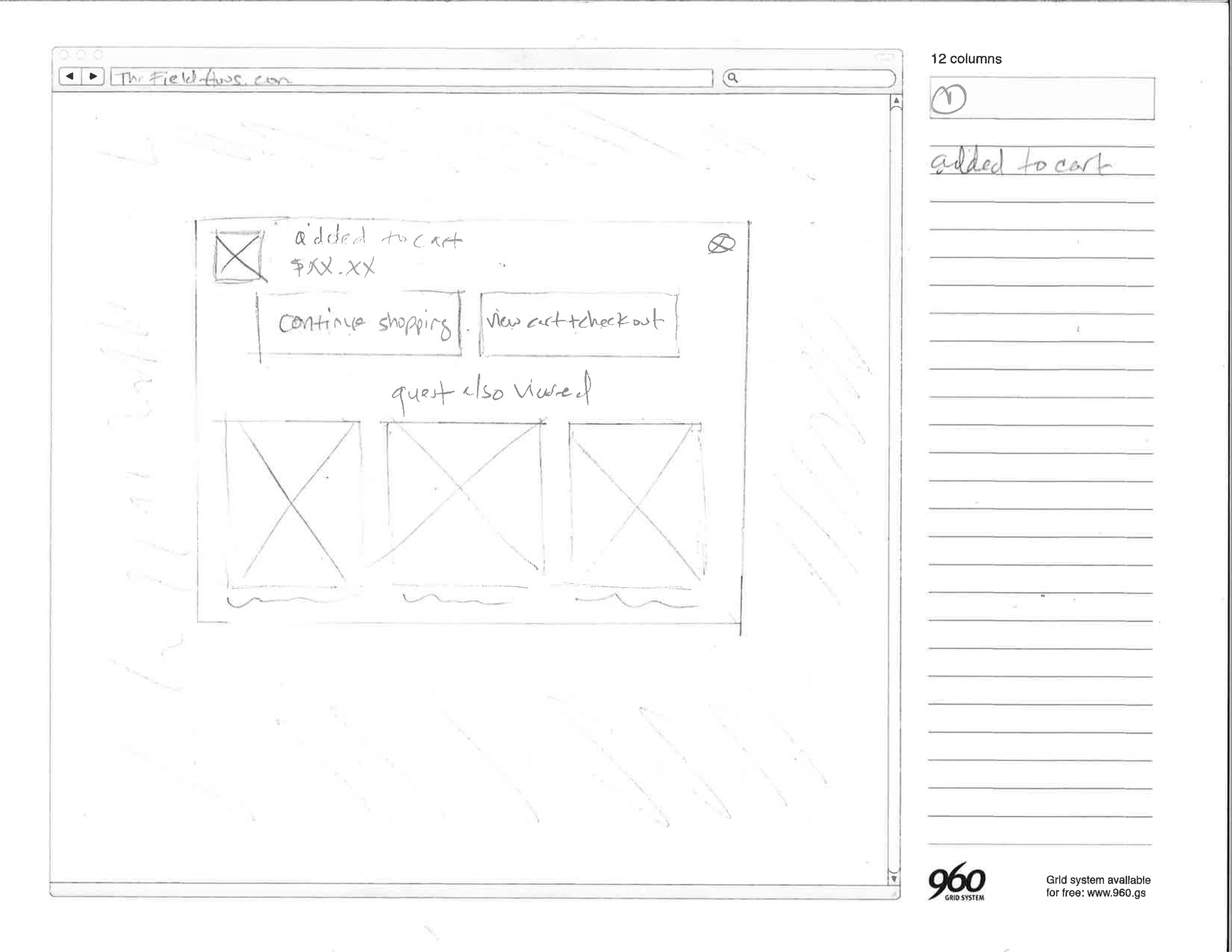
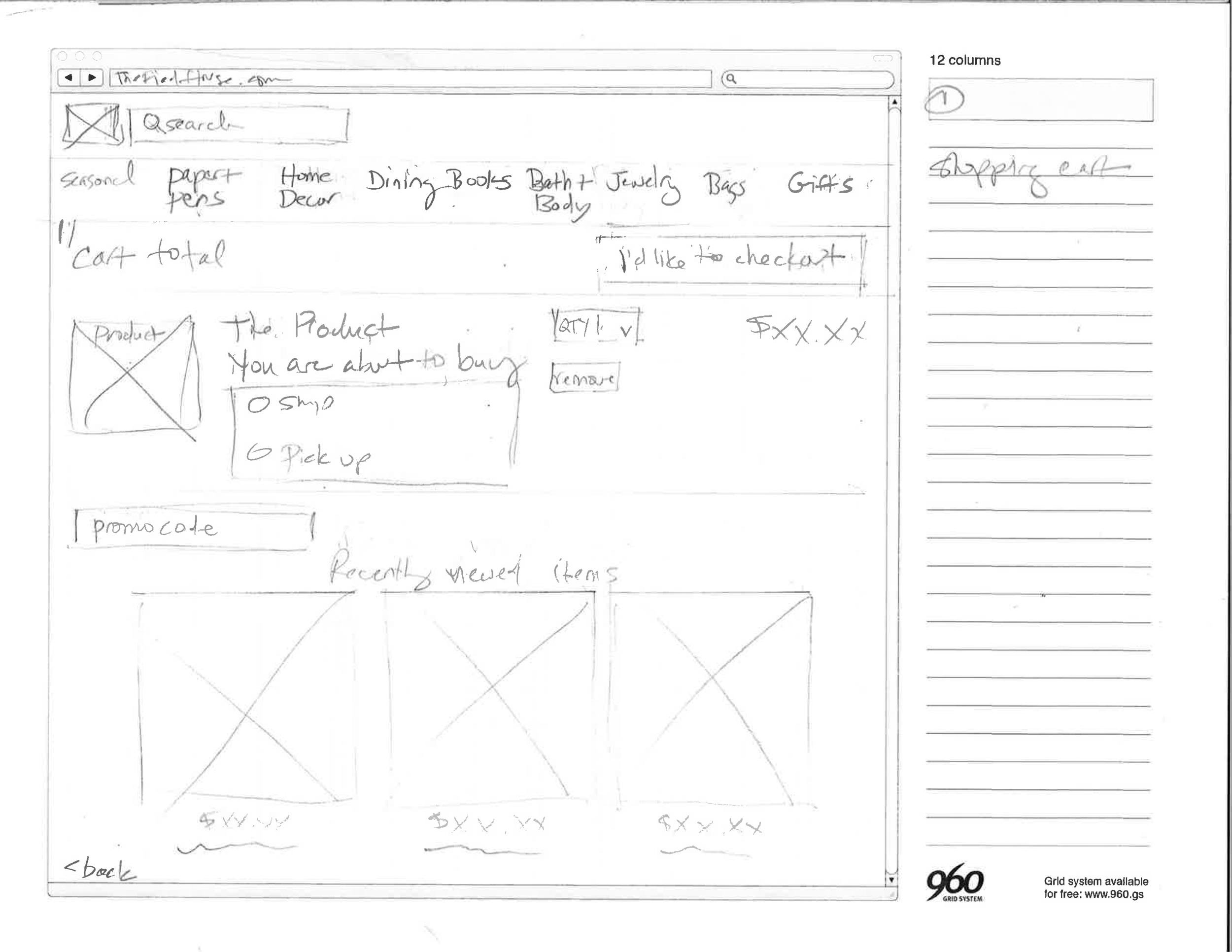
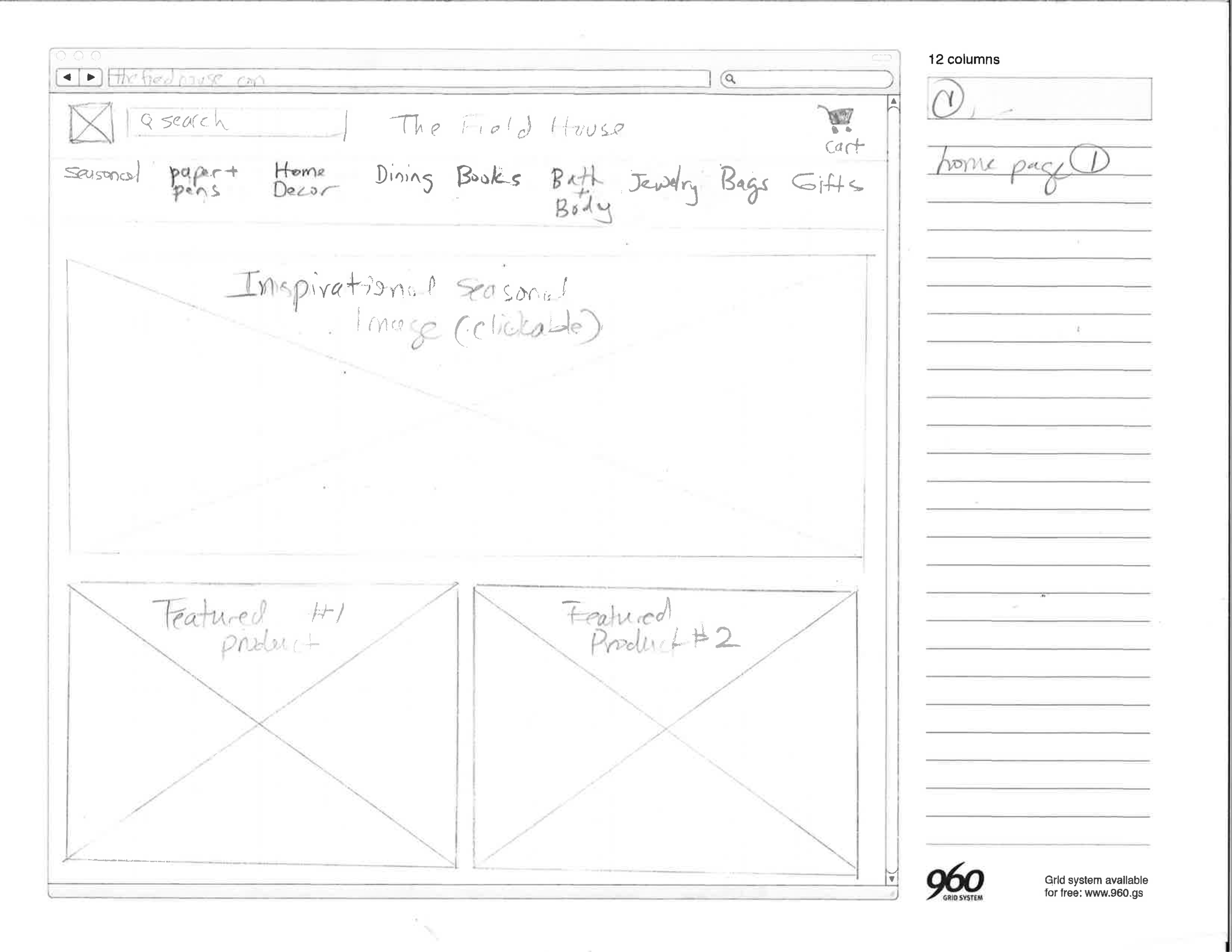
SKETCHING

VALIDATION
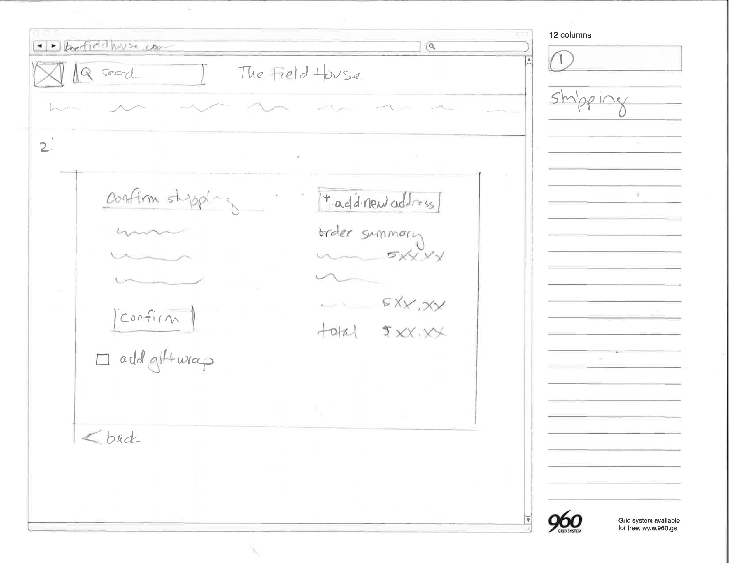
WIREFRAMES


USABILITY TESTING
Usability tests were conducted with a focus on recording feedback, task completion time, and improvements using a testing script. After the test, users completed an anonymous online screening survey and rated their experiences. These were the next steps based on my results:
Relink dead links.
Add ratings and reviews
Create a soft registration
Create a login for repeat customers
Fix the credit card input
Fix the symbol to advance to the next page
Fix the checkout button
Move the shipping options
Make some design tweaks