A small case study completed at a rapid pace as an
introduction to the UX Design process.
OVERVIEW
This was my first ever UX Design project. We broke into pairs and interviewed our teammates in an effort to identify an everyday problem that they had. We then designed a rough, iterative prototype that addressed the problem identified through interviewing our partner. This project was intended to be completed at a rapid pace as an introduction to the UX Design process.
METHODS
- User Interviews
- Contextual Inquiries
- User Flows
- Storyboards
- Rough Sketches
- Multiple Possible Solutions
- Paper Prototyping
- Usability Testing and Results
- Multiple Iterations
Contextual inquiry
I was paired up with Sam. We started chatting and it soon became clear to me that Sam was a guy concerned with his health and fitness. At first I thought we were headed in the direction of some kind of fitness app. As we continued the contextual inquiry, he told me about all the times he'd missed lunch or eaten at his desk during that week.
Sam admitted he had eaten at McDonald's that day. Something he hadn't wanted to do. He had so little time, he really wanted to just grab some food and know immediately the food's calorie content before eating it. He also didn't want to spend a lot of money. Sam wasn't "lovin' it".
USER INTERVIEWS
I conducted a total of three user interviews asking several open ended questions about peoples' lunch habits.
affinity diagram
I wrote quotes from the notes I had taken during my user interviews on post-it notes. After grouping them in categories on the wall, it was clear several people were having the same lunch issues as Sam.
PROBLEM STATEMENT
User needs a way to eat a healthy lunch given time constraints and budget.

Affinity Diagram
“I didn’t have time to find out what was available to eat around me. I didn’t want to be back to class late.”
“I don’t want to stand in line.”
“I ate at my computer.”
user flow
I created a user flow for the app. I started brainstorming on the kind of options and features my app was going to offer. I knew I needed a way for people to be able to find the food they wanted fast, and be able to pay for it with a credit card and pick it up. The flow had to be simple and offer the user a way to navigate without making too many decisions.
StoryBoard
A story board helped me to create a scenario and really understand the problem I was going to solve. In my storyboard, the user is pressed for time and is super hungry. She needs to find food fast and she needs to know long it's going to take. She also wants options. In the end, she is able to find a healthy lunch, fast and had achieved relief from "hanger".
Sketching & paper prototyping
After sketching out some rough ideas for my app, it was time to get to work on a paper prototype that I could test. I used note cards to simulate the mobile screens and switched out the cards to follow my user flow.
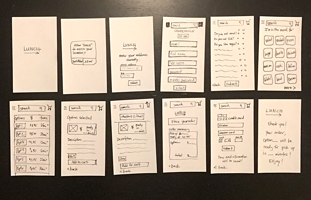

USER TESTING
Insights from testing:
- I forgot to create a way to pay without a user profile
- Users were able to complete the task of ordering lunch
- Users were happy when they ordered lunch so quickly with few steps
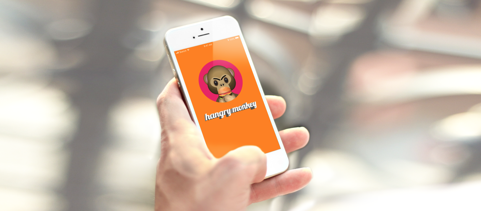
CLICKABLE LO-FI-PROTOTYPE
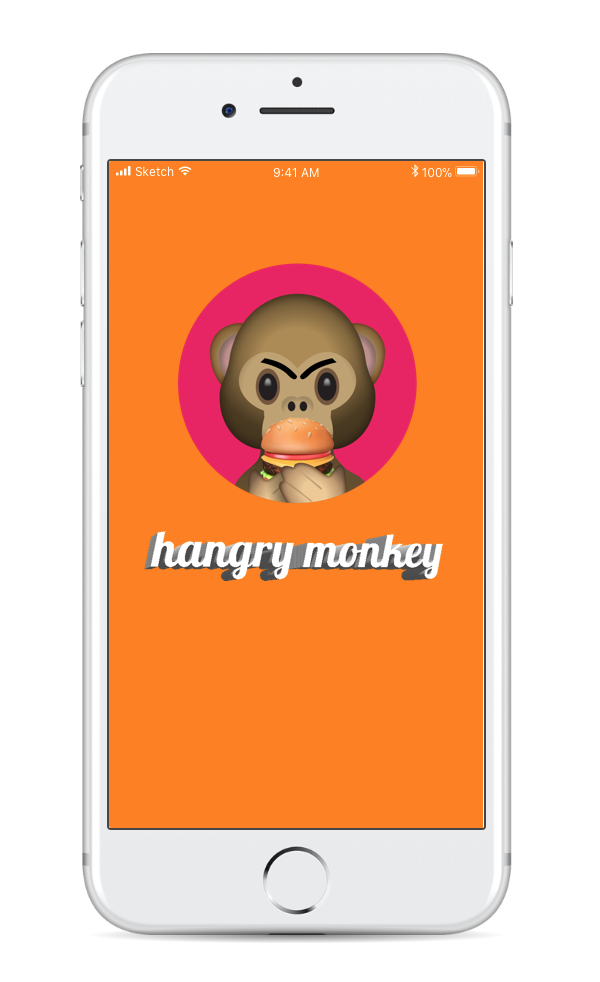
Originally the app was going to be called Hungry. Boring! So I decided to have a little fun with it and call it "Hangry Monkey". I went back and created a new app landing image in photoshop that was playful and might make people smile when they are so hungry they're about to have a melt-down.
REFLECTIONS
So, there you have it. My first attempt at making a mobile app. So fun! And that's when I became hooked on UX.